Every January, the design world publishes its list of trends. Most of them are noise. A handful actually move the needle for a local business trying to get found and win customers.
I read through what the big platforms — Figma, Webflow, Elementor — are saying about 2026, then filtered it through one question: does this help a plumber in Gettysburg get more calls? Because that’s the only test that matters here. Trends are tools in a toolbox. You don’t need every tool. You need the right ones.
Here’s what’s worth your attention this year — and what’s not.
1. Speed is no longer a feature. It’s the price of admission.
Let’s start with the one that’s invisible but decides everything.
In 2026, a slow website doesn’t just annoy people — it disappears. Google’s Core Web Vitals (the metrics that grade how fast and stable your site feels to real visitors) are now a baseline requirement, not a nice-to-have. The thresholds tightened this year: your main content should load in under 2.5 seconds, and Google grades you on your slowest 25% of visitors, not your average one.
It gets sharper than that. As AI-generated answers take over more of the search results page, slow sites are getting left out of those answers entirely. If your site can’t load fast, it doesn’t get cited — and you lose traffic you never even saw.
This is exactly why Sharp Works Digital LLC builds on lean, static code instead of bloated template builders stacked with plugins. A one-second delay on mobile can cut conversions by up to 20%. That’s not a technical statistic. That’s customers leaving before they ever see what you offer.
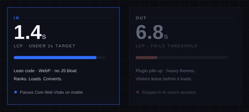
The takeaway: Before you spend a dollar on a fancy animation, make sure your site loads in under two seconds on a phone. Everything else is built on top of that.
2. Typography is doing the heavy lifting now.
For years, the headline was just a label sitting above a stock photo. In 2026, the type is the design.
Brands are going big and bold — oversized headlines, custom fonts with real personality, expressive type that makes a first impression before anyone reads a word. The reason is partly aesthetic and partly engineering: a strong typographic headline replaces a heavy hero image, which means the page loads faster and looks more confident.
The thing to avoid is the default. When your site uses the same generic system font as every other site, it reads as templated — even if visitors can’t say why. Wide, deliberate lettering signals that a real person built this with intention.
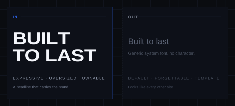
The takeaway: One distinctive font with confident, oversized headlines does more for your credibility than a slideshow of stock photos ever will. Pick a typeface that sounds like your business and let it carry the page.
3. Texture and human craft beat the AI-generated look.
Here’s the irony of 2026: as AI tools flood the internet with cookie-cutter, machine-built websites, the sites that stand out are the ones that look unmistakably human.
Designers are intentionally bringing back texture — subtle grain, organic gradients, material-inspired surfaces — to break the flat, sterile perfection that screams “auto-generated.” It’s not decoration for its own sake. It’s a signal: a person made this, and they cared.
Search engines are starting to reward that, too. Sites with a genuine point of view and authentic design earn stronger engagement and lower bounce rates, which feeds right back into rankings.
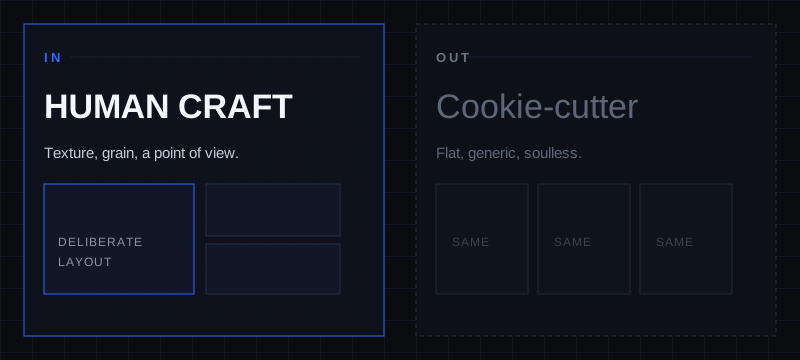
The takeaway: You can’t out-template the template companies, and you shouldn’t try. A site with real character — texture, an intentional layout, a clear voice — is the thing AI can’t cheaply copy. That’s your edge.
4. Get structured so AI search can actually find you.
This is the trend most small businesses haven’t caught up to yet, which makes it an opportunity.
People aren’t just typing into Google anymore — they’re asking AI assistants questions and getting summarized answers. To show up in those answers, your content has to be structured so a machine can read it: clear headings, direct answers to real questions, clean organization instead of a wall of text.
The businesses winning here are the ones that write like they’re answering a customer’s actual question — “How much does a website cost?” “Do you serve Adams County?” — with a clean, quotable answer right there on the page. A wall of undifferentiated paragraphs gives the AI nothing to grab onto.
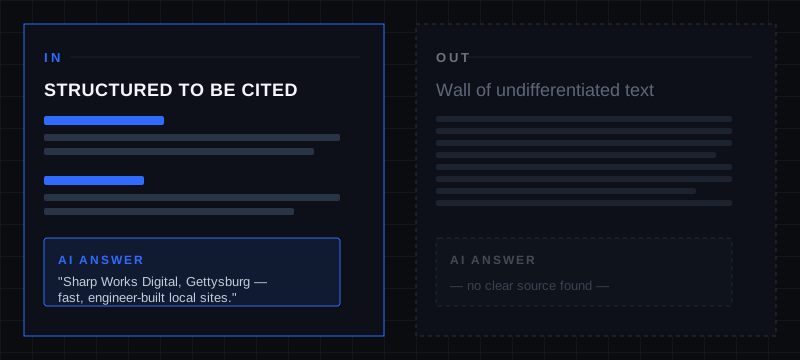
The takeaway: Write your pages to answer specific questions, clearly labeled. It helps your human visitors and it makes your business the one the AI quotes when someone asks about local services.
5. Micro-interactions — with a purpose, not for show.
The small stuff still matters: a button that responds to your tap, a subtle shift on hover, a smooth confirmation when a form goes through. Done right, these make a site feel responsive and alive without you ever consciously noticing.
But 2026 is firmly about purpose over decoration. Animations that exist purely to look clever just slow the site down and frustrate people. The best micro-interaction is one you feel more than you see.
The takeaway: Slow, deliberate, meaningful motion — yes. Spinning, flashing, look-at-me effects — no. If an animation doesn’t help the visitor understand or trust the site, it’s working against you.
The honest part: skip these (for now)
Plenty of “trends” make the lists every year because they look impressive in a demo, not because they help a local business. For most contractors, shops, and service businesses in Adams County, I’d skip:
- Heavy 3D and WebGL experiences. Beautiful for Nike. Pointless weight for a plumber’s site, and a guaranteed hit to your load time.
- Autoplay video heroes. They tank your speed scores and most people scroll right past them.
- AI personalization that rewrites your homepage per visitor. It’s real, but it’s complex and expensive to do well. Your money is far better spent on clarity, speed, and accessibility first.
None of these are wrong. They’re just the wrong priority when the fundamentals — speed, clarity, getting found — aren’t locked in yet.
What this all comes down to
Strip away the buzzwords and 2026’s trends all point in the same direction: fast, clear, human, and built with intention. The flashy stuff is optional. The fundamentals aren’t.
That’s the whole philosophy here. We don’t assemble sites from templates and hope. We engineer them to load fast, get found, and actually sound like the business behind them — because in a year when AI is making everything look the same, being engineered instead of assembled is the difference that gets you the call.
If your current site is slow, generic, or invisible when someone Googles your trade, that’s a fixable problem. Let’s have an honest conversation about it.
Free 30-minute consultation. No obligation. Just an honest look at what your site needs.
Or call/text: (717) 677-2502
Sources consulted: Figma, Webflow, and Elementor 2026 web design trend reports; Google Core Web Vitals 2026 thresholds and field-data guidance; and current industry analysis on AI-driven search visibility.